The R package ggstudent provides an extension to ggplot2
for creating two types of continuous confidence interval plots (Violin
CI and Gradient CI plots), typically for the sample mean. These plots
contain multiple user-defined confidence areas with varying colours,
defined by the underlying t-distribution used to compute standard
confidence intervals for the mean of the normal distribution when the
variance is unknown.
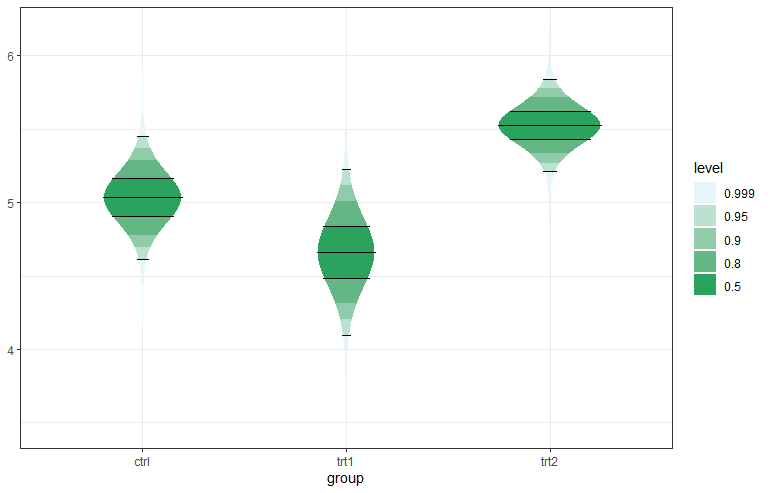
Two types of plots are available, a gradient plot with rectangular areas, and a violin plot where the shape (horizontal width) is defined by the probability density function of the t-distribution.
Note that these (and much more) is available also in the ggdist
package.
See also the related paper and repository.
Here is an example:
library("magrittr")
library("dplyr")
library("ggplot2")
library("scales")

ci_levels <- c(0.999, 0.95, 0.9, 0.8, 0.5)
n <- length(ci_levels)
ci_levels <- factor(ci_levels, levels = ci_levels)
PlantGrowth %>% dplyr::group_by(group) %>%
  dplyr::summarise(
    mean = mean(weight),
    df = dplyr::n() - 1,
    se = sd(weight)/sqrt(df + 1)) %>%
 dplyr::full_join(
   data.frame(group =
     rep(levels(PlantGrowth$group), each = n),
     level = ci_levels), by = "group") -> d

p <- ggplot(data = d, aes(group)) +
 geom_student(aes(mean = mean, se = se, df = df,
   level = level, fill = level), draw_lines = c(0.95, 0.5))

g <- scales::seq_gradient_pal("#e5f5f9", "#2ca25f")
p + scale_fill_manual(values = g(seq(0, 1, length = n))) + theme_bw()